The Psychology of the Slab Serif: How Coca-Cola’s Font Revamp Ignited a Global Brand Identity Debate

The global beverage giant Coca-Cola recently found itself at the center of an unexpected controversy, sparking widespread consumer uproar not over a new flavor or marketing campaign, but over a seemingly minor element of its visual identity: a typeface. This incident, which unfolded earlier this week, has underscored the profound and often underestimated psychological bonds consumers forge with iconic brands, demonstrating that even subtle changes to cherished visual cues can trigger intense reactions and robust public debate.
The Genesis of the Uproar: A New Global Visual Identity
Coca-Cola unveiled a "new global visual identity system," a comprehensive redesign developed in collaboration with the renowned creative agency JKR. This ambitious overhaul aimed to modernize the brand’s aesthetic while maintaining its inherent recognition and heritage across diverse international markets. The new system introduced refinements to two of Coca-Cola’s most hallowed visual assets: the distinctive Spencerian script, which has graced its products for over a century, and the iconic "dynamic ribbon" that flows beneath it, symbolizing refreshment and movement.
However, the element that truly ignited the firestorm was the introduction of a new complementary slab serif font, christened "Better With." Intended to provide a contemporary counterpoint to the classic script, this new typeface quickly became the focal point of a consumer backlash. The collective disgruntlement stemmed from a perceived, rather than strictly factual, resemblance between "Better With" and the proprietary typeface used by Marlboro cigarettes, particularly when presented in Coca-Cola’s signature red and white color palette.
The "Marlboro Soda" Phenomenon: Social Media Amplifies Outcry
The immediate aftermath of the rebrand saw a torrent of reactions across social media platforms, predominantly on X (formerly Twitter). Consumers swiftly drew parallels, voicing their surprise and disapproval with striking uniformity. One commentator on X, Konraddin, succinctly captured the sentiment, asking, "Am I the only one seeing Marlboro soda?" This rhetorical question quickly resonated, echoing across countless posts. Another user, the_davidhicks, posted, "Coca-Cola using the Marlboro font in their new rebrand. Very odd." The perception was so strong that MoMohler added, "Any person over 40 realizes that this is the Marlboro font," highlighting a generational awareness of visual branding cues.
This widespread perception, fueled by the rapid dissemination of images and opinions on social media, created a viral moment that Coca-Cola likely did not anticipate. The juxtaposition of a beloved, family-friendly beverage brand with a product long associated with significant health risks struck many as incongruous and unsettling. The irony of "high-sugar sodas becoming a Gen Z stand-in for tobacco—’fridge cigs’" as some observers quipped, only amplified the absurdity for many.
Fact vs. Perception: The Nuances of Typography
For the record, industry experts and typographic analysts have confirmed that the "Better With" font is not, in fact, the same as Marlboro’s proprietary typeface. Marlboro utilizes a custom-designed font, with its nearest commercial equivalent often cited as Neo Contact. There are indeed various structural and stylistic differences between "Better With" and Marlboro’s font, discernable to a trained eye. However, in the realm of consumer perception, particularly when amplified by strong brand colors and historical associations, these subtle technical distinctions often become secondary to the immediate visual impression. The overall "feel" of the font, combined with the dominant red and white, was sufficiently close to trigger a powerful associative memory for a significant segment of the public.
Corporate Silence and Expert Insights
In response to inquiries regarding the controversy, Coca-Cola did not issue an official statement or provide comment. JKR, the agency behind the design, referred ADWEEK’s inquiry back to Coca-Cola, maintaining a similar silence. This lack of immediate official response further allowed the public narrative to be shaped by consumer reactions and expert analyses.
Brand strategy experts were quick to weigh in, offering insights into the deeper psychological underpinnings of the backlash. Sabrina Babooram, partner and head of strategy at Toronto-based agency Academy, articulated the core issue: "With Coke, the font became the focus because it’s a key identifier of a brand that’s been a part of our lives for generations." This sentiment was echoed by Allen Adamson, cofounder of Metaforce and a veteran of Landor, an agency that managed Coca-Cola’s brand in the 1980s. Adamson observed, "Coke is wallpaper in people’s lives. Change the wallpaper even a little, and people notice."

This "wallpaper" analogy is particularly apt for a brand like Coca-Cola, which boasts a global presence and market share that positions it as one of the world’s most recognized and valuable brands, estimated in the tens of billions of dollars. Its visual identity elements, from the iconic bottle shape to the distinctive script, are deeply ingrained in the collective consciousness across cultures and generations. Any alteration, no matter how seemingly minor, can disrupt this established mental schema, leading to feelings of disorientation or even betrayal among loyal consumers.
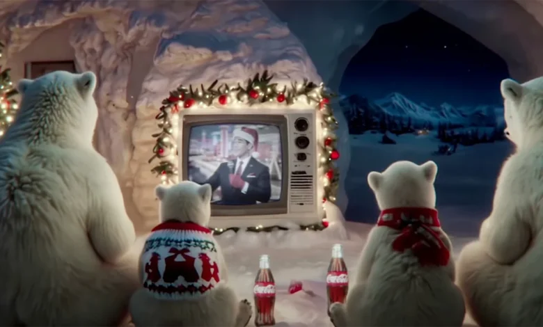
Interestingly, Adamson also pointed out that the "Better With" typeface had a soft launch, briefly debuting in Coca-Cola’s holiday marketing campaigns in 2023. At that time, "nobody blinked," he noted, suggesting that the context of its deployment (a full global rebrand versus a seasonal campaign) and the heightened scrutiny it garnered in the broader visual identity system played a significant role in the current controversy.
A History of Rebranding Backlashes: Lessons from Industry Giants
The tumult surrounding Coca-Cola’s typeface is far from an isolated incident; it is a recurring theme in the annals of brand management. Brands, particularly those with a deep heritage and widespread consumer loyalty, frequently face significant pushback when attempting to modernize or alter their visual identities. These instances serve as powerful reminders of the emotional investment consumers place in the brands they love.
- Ikea (2009): The Swedish furniture giant faced a fierce backlash when it decided to abandon its long-standing Futura typeface in favor of Veranda. Fans, many of whom appreciated Futura’s clean, modern, and democratic aesthetic that aligned with Ikea’s brand values, felt the change was unnecessary and detracted from the brand’s identity.
- Tropicana (2009): In another high-profile case from the same year, Tropicana, a PepsiCo brand, undertook a comprehensive redesign of its orange juice carton and logo. The redesign, which included a change in typeface and a simplified carton design that removed the iconic orange-with-a-straw image, was met with widespread consumer rejection. Sales plummeted by an estimated 20% in just one month, leading Tropicana to hastily revert to its previous branding, demonstrating the tangible financial risks of alienating a loyal customer base.
- Gap (2010): The American apparel retailer Gap experienced a similarly swift and embarrassing reversal. After unveiling a new logo that replaced its classic serif font and blue box with a minimalist Helvetica font and a small blue square, the public outcry was immediate and overwhelming. Social media, still in its nascent stages compared to today, played a crucial role in amplifying the negative sentiment. Within days, Gap announced it would revert to its traditional logo, a testament to the power of collective consumer opinion.
- Jaguar (2024): More recently, the luxury automotive brand Jaguar faced significant criticism for its 2024 rebrand. This overhaul included the abandonment of its long-used Optima typeface and a shift towards a more minimalist, digitally-oriented visual language. The changes were so contentious that British politician Nigel Farage famously called the overhaul "commercial suicide," highlighting the emotional attachment even high-end consumers have to traditional brand aesthetics.
These case studies collectively underscore a critical lesson: while brands must evolve to remain relevant in a dynamic market, the process of rebranding, especially for iconic entities, demands extreme caution, extensive consumer insight, and a profound respect for brand heritage.
The Psychology of Brand Ownership: Why We Care About Fonts
The core of these controversies lies in what experts describe as "psychological brand ownership." Consumers often feel a sense of personal connection and even ownership over brands that have been significant parts of their lives, woven into their memories and cultural experiences. When a brand alters its identity, it can feel like a personal affront, a disruption of something familiar and cherished.
John Arriaza, creative director of Chase Design Group, elaborated on this phenomenon: "Whether they consciously notice them or not, well-known brands have an amazing ability to trigger memories and emotional responses." He emphasized the critical role of diligence in design: "With brands that own a very strong brand color, it’s upon us as creators/designers to do diligence and look at other brands that own a similar color." The same principle, he noted, applies equally to typefaces. A font is not merely a stylistic choice; it conveys personality, tone, and historical context. When a font inadvertently evokes associations with a contradictory or negative brand, the impact can be detrimental.
This psychological bond is not merely aesthetic; it’s rooted in cognitive processing. Visual elements like color and typography act as rapid cues for brand recognition and recall. They bypass conscious thought, triggering immediate associations and emotional responses. When these cues are altered, especially in a way that creates an unexpected or negative association (like Marlboro for Coca-Cola), it can create cognitive dissonance and a sense of betrayal.
Broader Implications for Brand Management in the Digital Age
The Coca-Cola typeface controversy offers several crucial takeaways for brand managers, designers, and marketers in the contemporary landscape:
- The Power of Collective Memory: Brands with decades of history carry an immense weight of collective memory. Changes must be introduced with an acute awareness of this heritage and the potential for disrupting deeply ingrained associations.
- Social Media as an Amplifier: In the age of instant communication, social media platforms serve as powerful amplifiers of consumer sentiment. Negative reactions can go viral within hours, creating a public relations challenge that traditional media channels might not have generated as quickly or intensely.
- The Subtlety of Semiotics: Every visual element of a brand—color, shape, logo, and typeface—carries semiotic meaning. These meanings are often culturally and historically conditioned. Designers must conduct exhaustive due diligence to ensure that new elements do not inadvertently convey unintended or negative messages.
- Balancing Evolution and Heritage: Brands face the perennial challenge of remaining relevant without abandoning their core identity. The desire to modernize, appeal to new demographics, or streamline visual systems must be carefully balanced with the need to preserve elements that resonate with long-standing loyal customers.
- The Value of Contextual Testing: While the "Better With" font appeared in holiday marketing without incident, its deployment as part of a comprehensive global identity system changed its context and the level of scrutiny. This highlights the importance of testing new visual elements not just in isolation, but within the full scope of a brand’s communication and application.
- The Risk of "Fridge Cigs": The "Marlboro soda" association, however technically inaccurate, points to a broader cultural commentary. It underscores how consumers draw connections between brands, especially in the context of perceived health implications or lifestyle choices, even if those connections are tangential.
Conclusion: The Enduring Power of Brand Identity
The Coca-Cola typeface controversy serves as a potent reminder that brand identity is far more than just a logo or a color scheme; it is a complex tapestry of visual, emotional, and historical associations deeply woven into the fabric of consumer consciousness. For a brand as globally ubiquitous and historically rich as Coca-Cola, even a seemingly minor change to a typeface can trigger a significant public reaction. This incident reinforces the critical lesson that while innovation is essential for growth, understanding and respecting the profound psychological bonds consumers have with their favorite brands is paramount. In the delicate art of brand management, designers and marketers must always remember that they are not just shaping visual assets, but also managing the collective memories and emotional investments of millions worldwide. The future of brands, as the ongoing debate around "Better With" demonstrates, is indeed decided in these subtle yet powerful moments of connection and perception.